Cancelling the Economist was a horrible experience
I’ve been searching for more traditional (well...) news outlets the past couple of months, and have ended up with a bunch of subscriptions. Some might actually stick, others won’t.
The Economist is, unfortunately, one of the latter. I cancelled my subscription today, and won’t be subscribing again. The Economist is employing dark patterns to lure subscribers to stay on. It probably works in many cases too, since this is the sort of publication that generally has subscriptions through companies, and thus people are less mindful of the money.
It’s a shame really. The site experience, and the app, was positive during my time as a subscriber. I could even get proper receipts without having to pester customer support, something neither The New Yorker nor MIT Technology Review (who hasn’t answered my emails with requests for one either) has been able to produce. In my ignorance, I believed the cancellation process would be just as smooth, and it sure looks like it at first glance.
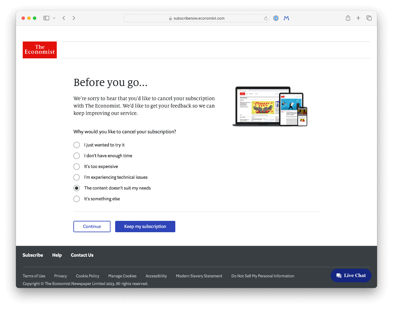
That is, until you get to this screen, which switches the color state of the confirmation (which now looks like you want to cancel your, err, cancellation) and keep my subscription buttons. I clicked the wrong button twice in haste, which sends me to the front page, forcing me to go through the same hoops again.
This is a dark pattern, and it’s evil.
Still, I was willing to accept this, until I reached the next screen. Because, yeah, despite these questions, and an in all other parts working self-service My Account system, they require you to either chat with, or call, customer service to finish your cancellation.
That’s a big no-no, in case you didn’t know.
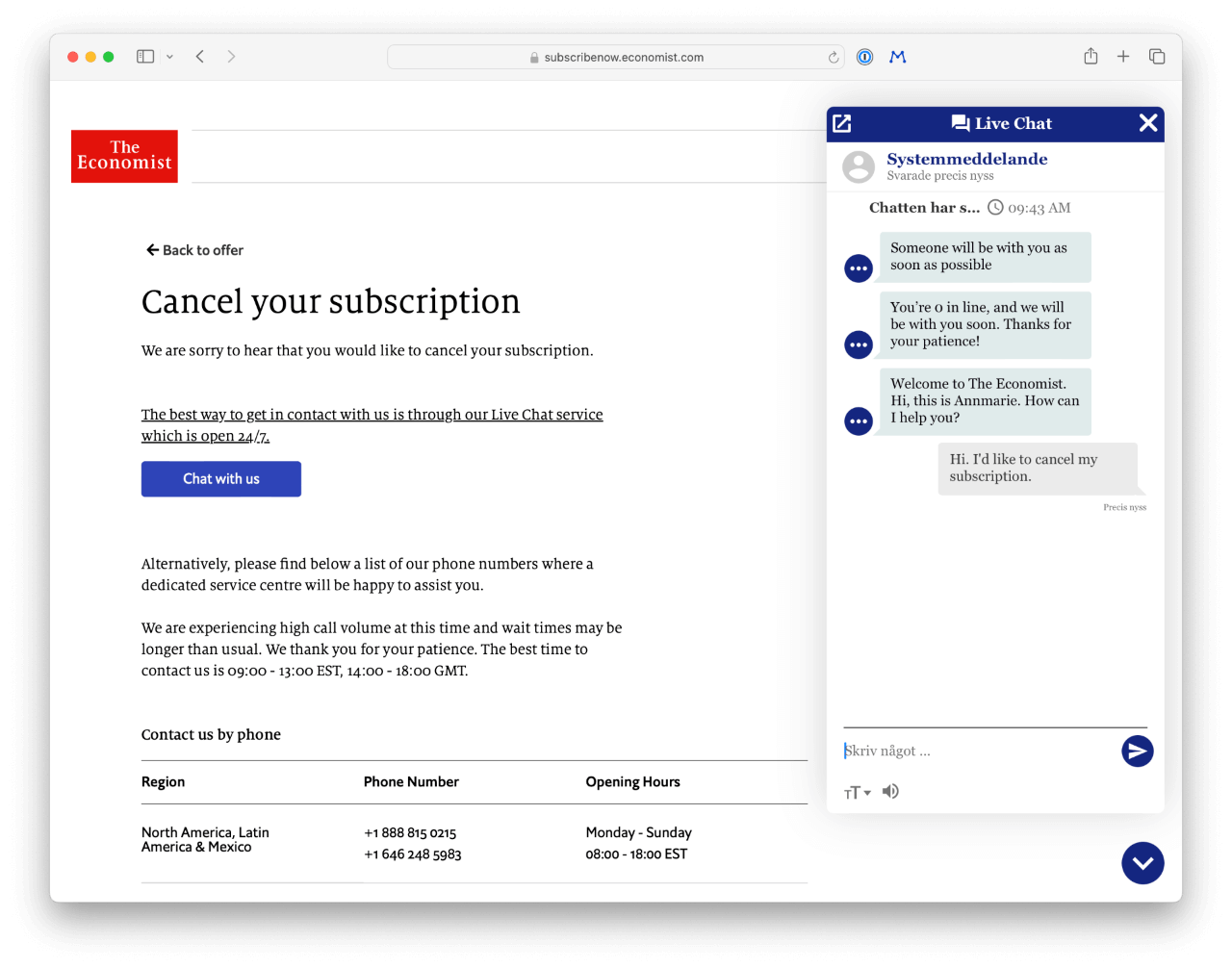
Now, the Economist doesn’t cost a lot, and I was really on the verge of keeping it a little while longer. Let me tell you, all such feelings quickly evaporated. The customer service live chat, which clearly follows a customer journey pattern and takes longer than it should (approximately 10 minutes), is another dark pattern. Parts of it reads like a chatbot, the other part is just offers and sales pitches. There’s not a lot of conversation at all, they just hope that you’ll run out of time and close the window, so that you’ll have to start over again.
That’s how they get you: It takes too long, so long, in fact, that it’s cheaper to keep your subscription.
I’ll be honest, it probably would’ve worked if they hadn’t tried to trick me twice. Now, I turned down an offer which gave me 6 months for less than I’d paid for one (an insult in itself), just because their methods burned me.
Don’t support dark patterns. Don’t sign up for The Economist.